Presented below are some of the more advanced concepts, topics and bullet points I like to cover in my Advanced excel courses.
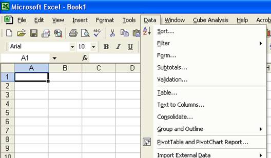
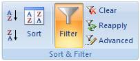
The Data Menu - Perhaps the parts of Excel that are of most value to CPAs, but least used by CPAs are the Data commands found under the Data menu in Excel 2003 and earlier, and on the data Ribbon in Excel 2007. These commands are shown below, and we will concentrate the next hour to studying these commands.

Data Sort - The Sort tool does exactly what it implies – it sorts and data. Key sorting points are as follows:
1. Contiguous Data - The “A to Z” sorting tool can sort large matrix of data automatically as long as the data is contiguous. In other words, your data should contain no blank columns, no blank rows, and the columns must all be labeled. Only then will Excel always correctly select the entire matrix for sorting.
2. A to Z Button - Simply place the cursor in the desired column for sorted, and press the A to Z or Z to A button as the case may be. Excel will automatically sort all continuous columns that have headings and all contiguous rows from the top row under the heading labels down to the last row in the selected column that contains data. (Note - If you accidently select 2 cells instead of just one, your results will not be correct.)
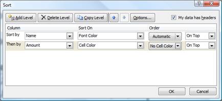
3. Sort by 64 Columns - The “Sort” tool is dramatically enhanced in Excel 2007 as it now provides the ability to sort by up to 64 columns, instead of just 3 columns. Presented below is a dialog box which shows this expanded functionality.

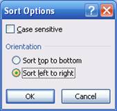
4. Sort Left to Right – Excel has always provided the ability to sort left to right. To do so, select the options box in the Sort Dialog box and click the check box labeled “Sort left to Right” as shown below.
5. Sort by Color – Excel 2007 now provides the ability to sort by font color or by cell color, or both. This is handy in many ways. Sometimes CPAs use color to tag or mark certain cells - and later find it useful to be able to sort by those markings. In other situations CPAs use conditional formatting to apply color to cells using a wide variety of rules. Thereafter Excel can sort the data based on the resulting colors. The sort-by-color options are shown below.
To be accurate, it was possible to sort by color in Excel 2003. To accomplish this task, you needed to use the =CELL function in order to identify information about a given cell such as the cell color or font color. Thereafter, the results of that function could be used to sort rows – which effectively means that you can sort by color in Excel 2003 – but it takes a bit more effort.
6. Sort By Custom List – Another sorting capability in Excel is the ability to sort by Custom List. For example, assume a CPA firm has ten partners, and the Managing partner prefers to be shown at the top of the list, and the remaining Partners based on seniority. In this case, you could create a Custom List in the excel Options dialog box listing the partners in the desired order, and then sort future reports based on that order.
Perhaps a better example use of this feature would be to create a non-alphabetic custom list of your chart of accounts, and then sort transactions to produce a general ledger in chart of account order – even if your preferred chart of accounts is not alphabetical. the partner seniority does not match the alphabetic names, nor any
Filtering Data - Using AutoFilter to filter data allows you to view a subset of your data in a range of cells or table. Once you have filtered the data, you can apply additional filters to further refine your data view. When you are done, you can clear a filter to once again redisplay all of the data. To use this tool, start with any list of data and turn on the AutoFilter tool. Then position your cursor in the column you want to filter and use the drop down arrows to apply your filters as shown in the screen below.
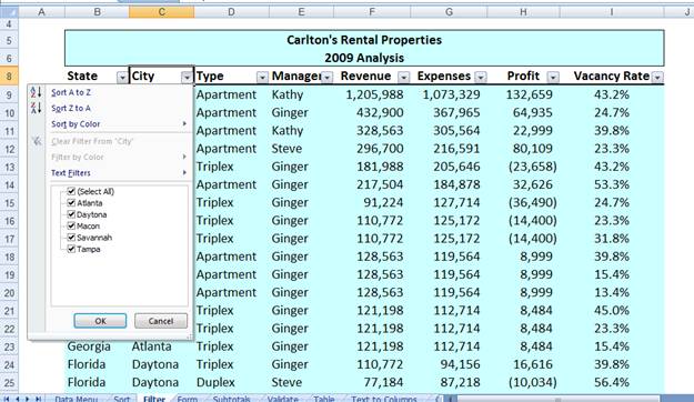
Once the filters are applied, you will see a subset your data. For example, the screen presented below shows filtered data for only Macon and Savannah properties.
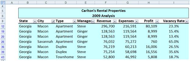
As filters are applied, a small funnel appears in the drop down arrow button to indicate that a filter has been applied. You can apply filters for multiple columns simultaneously.
Key Points Concerning The AutoFilter Command:
1. Contiguous Data – The AutoFilter tools works best when you are working with data that is contiguous. In other words, your data should contain no blank columns, no blank rows, and the columns must all be labeled.
2. Filter by Multiple Columns - You can filter by more than one column.
3. Removing Filters – In Excel 2003 and earlier, a faster way to remove multiple filters is to turn off filtering and then turn filtering back on. In Excel 2007 you can simple click the Clear button in the Sort and Filter Group as shown below.
4. Filters are Additive - Each additional filter is based on the current filter and further reduces the subset of data.
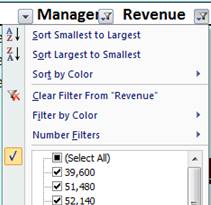
5. Three Types of Filters – You can filter based on list values, by formats, or by criteria. Each of these filter types is mutually exclusive for each range of cells or column table. For example, you can filter by cell color or by a list of numbers, but not by both; you can filter by icon or by a custom filter, but not by both.
6.
Filters Enabled -
A drop-down arrow ![]() means that filtering is enabled but not
applied.
means that filtering is enabled but not
applied.
7.
Filter Applied -
A Filter button ![]() means
that a filter is applied.
means
that a filter is applied.
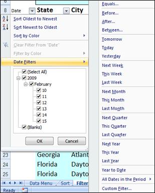
8. Filter Spanning - The commands under the All Dates in the Period menu, such as January or Quarter 2, filter by the period no matter what the year. This can be useful, for example, to compare sales by a period across several years.
9. This Year vs. Year-to-Date Filtering - This Year and Year-to-Date are different in the way that future dates are handled. This Year can return dates in the future for the current year, whereas Year to Date only returns dates up to and including the current date.
10. Filtering Dates - All date filters are based on the Gregorian calendar as decreed by Pope Gregory XIII, after whom the calendar was named, on 24 February 1582. The Gregorian calendar modifies the Julian calendar's regular four-year cycle of leap years as follows: Every year that is exactly divisible by four is a leap year, except for years that are exactly divisible by 100; the centurial years that are exactly divisible by 400 are still leap years. For example, the year 1900 is not a leap year; the year 2000 is a leap year.
11. Filtering By Days of Week - If you want to filter by days of the week, simply format the cells to show the day of the week.
12. Top & Bottom Filtering - On the Data tab, in the Sort & Filter group, click Filter. Point to Number Filters and then select Top 10. To filter by number, click Items. To filter by percentage, click Percent. Note - Top and bottom values are based on the original range of cells or table column and not the filtered subset of data.
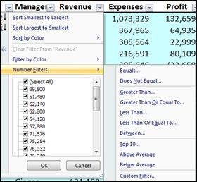
13. Above & Below Average Filtering - On the Data tab, in the Sort & Filter group, click Filter. Point to Filter by Numbers that are Above/Below Average. Note – These values are based on the original range of cells or table column and not the filtered subset of data.
14. Filtering Out Blanks - To filter for blanks, in the AutoFilter menu at the top of the list of values, clear (Select All), and then at the bottom of the list of values, select (Blanks).
15. Filtering By Color - Select Filter by Color, and then depending on the type of format, select Filter by Cell Color, Filter by Font Color, or Filter by Cell Icon.
16. Filter by Selection - To filter by text, number, or date or time, click Filter by Selected Cell's Value and then: To filter by cell color, click Filter by Selected Cell's Color. To filter by font color, click Filter by Selected Cell's Font Color. To filter by icon, click Filter by Selected Cell's Icon.
17. Refreshing Filters - To reapply a filter after the data changes, click a cell in the range or table, and then on the Data tab, in the Sort & Filter group, click Reapply.
Data Form – Excel’s 2003 Data Form tool makes Excel look more and behave more like a database, such as Microsoft Access. (The Form button has not been included on the Office Fluent user interface Ribbon, but you can still use it in Office Excel 2007 by adding the Form button to the Quick Access Toolbar.)
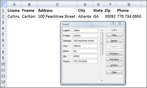
A data form provides a convenient means to enter or display one complete row of information in a range or table without scrolling horizontally. You may find that using a data form can make data entry easier than moving from column to column when you have more columns of data than can be viewed on the screen. Use a data form when a simple form of text boxes that list the column headings as labels is sufficient and you don't need sophisticated or custom form features, such as a list box or spin button.
Key Points using data Form:
1. You cannot print a data form.
2. Because a data form is a modal dialog box, you cannot use either the Excel Print command or Print button until you close the data form.
3. You might consider using the Windows Print Screen key to make an image of the form, and then paste it into Microsoft Word for printing.
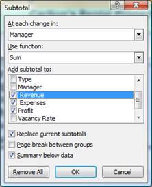
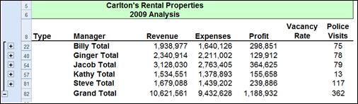
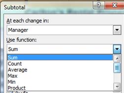
Data Subtotals – Excel provides an automatic subtotaling which will automatically calculate and insert subtotals and grand totals in your list or table. Once inserted, Excel recalculates subtotal and grand total values automatically as you enter and edit the detail data. The Subtotal command also outlines the list so that you can display and hide the detail rows for each subtotal. Examples of a the Subtotal dialog box and a resulting subtotaled table are shown below.
Key points to Consider When Using Subtotaling are as follows:
1. Contiguous Data – The Subtotal tools works best when you are working with data that is contiguous. In other words, your data should contain no blank columns, no blank rows, and the columns must all be labeled.
2. Sort Before Your Subtotal - You must sort the data by the column you wish to Subtotal by, else you will receive erroneous results.
3. Other Mathematical Applications - The Subtotal tool not only calculates subtotals, but it can also calculate minimums, maximums, averages, standard deviations, and other functions.
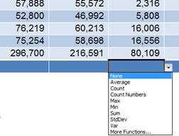
4. Subtotals in 2007 Tables – Excel 2007 deploys Subtotaling a little differently in that the Subtotal tool appears at the bottom of each column in each table, as shown in the screen below.
5. Automatic Outlining - Subtotaling automatically inserts Outlines, which is really cool. You can then condense and expand the data in total and by subtotal. Some CPAs also like to copy and paste the condensed subtotal information to another location but find that this process copies and pastes all of the data. There are two ways to achieve a clean copy and paste without grabbing all the hidden data as follows:
a. CTRL key – Hold the Control Key down while you individually click on each subtotal row. This will enable you to copy and paste just the subtotal data. This approach can be problematic because if you mis-click, you have to start over.
b. Select Visible Cells – A better approach is to use the Select Visible Cells tool. This tool will select on the data you can see, after which the copy and paste routine will yield the desired results. This option is better because it is faster and less error prone.
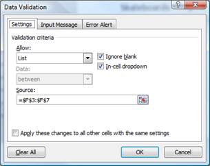
Data Validation
Data Validation can be used to limit the data that can be entered into a cell. For example, you might want the user to enter only values between 1% and 99%. You might also use this tool to enable data input to a drop down list. This has two advantages in that it can be faster and more accurate. Start with the dialog box below to create your drop down list functionality.
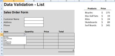
After making all the necessary selections in the validation list dialog box, your worksheet will behave as shown below.
You can also provide messages to define what input you expect for the cell, and instructions to help users correct any errors. For example, in a marketing workbook, you can set up a cell to allow only account numbers that are exactly three characters long. When users select the cell, you can show them a message such as this one:
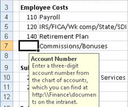
If users ignore this message and type invalid data in the cell, such as a two-digit or five-digit number, you can show them an actual error message. In a more advanced scenario, you might use data validation to calculate the maximum allowed value in a cell based on a value elsewhere in the workbook. In the following example, the user has typed $4,000 in cell E7, which exceeds the maximum limit specified for commissions and bonuses.
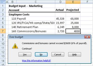
If the payroll budget were to increase or decrease, the allowed maximum in E7 would automatically increase or decrease with it.
PivotTables
The PivotTable report tool provides an interactive way to summarize large amounts of data. Use should use the PivotTable tools to crunch and analyze numerical data PivotTable reports are particularly useful in the following situations:
a. Rearranging rows to columns or columns to rows (or "pivoting") to see different summaries of the source data.
b. Filtering, sorting, grouping, and conditionally formatting your data.
c. Preparing concise, attractive, and annotated online or printed reports
d. Querying large amounts of data.
e. Subtotaling and aggregating numeric data.
f. Summarizing data by categories and subcategories
g. Creating custom calculations and formulas.
h. Expanding and collapsing levels of data.
i. Drilling down to details from the summary data
In essence, PivotTables present multidimensional data views to the user – this process is often referred to as “modeling”, “data-cube analysis”, or “OLAP data cubes”. To re-arrange the PivotTable data, just drag and drop column and row headings to move data around. PivotTables are a great data analysis tool for management.
If you have never used a PivotTable before, initially the concept can be difficult to grasp. The best way to understand a PivotTable is to create a blank Pivot Table and then drag and drop field names onto that blank table. This way you will see the resulting pivot table magically appear and it will help you better understand the important relationship between the pivot pallet and the field name list.
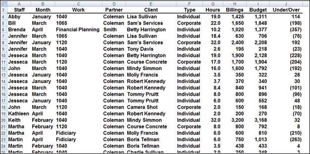
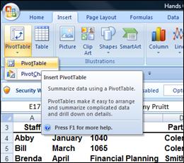
Let’s create a simple PivotTable. Start with an Excel worksheet data that contains several columns of data – the data must include column and row headings and it helps if the data is contiguous. Place your cursor anywhere in the data and select PivotTable from the Data menu in Excel 2003 and click Finish; or from the insert Ribbon in Excel 2007. This process is shown below: Let’s start with a page of data summarizing the results of tax season as all of the time sheet entries have been entered onto a single worksheet as shown below.
Place your cursor anywhere in the data and select PivotTable from the Insert Ribbon as shown below:
For learning purposes let’s right mouse click on the pivot table and select PivotTable Options, Display, Classic PivotTable Layout. Your screen will now appear as follows:
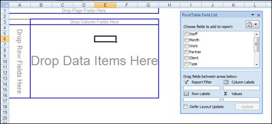
I like for CPAs to learn how to use Pivot Tables in this view because it visually helps them understand the all important relationship better the blank pivot palette and the PivotTable field List, both elements of which are shown in the screen above.
To proceed, simply drag and drop field names shown on the right onto the blank Pivot palette shown on the left. With each drop, your report grows larger. As an alternative you could use the check boxes next to field names – this functionality is new in Excel 2007. After added some data to your blank Pivot Palette, your data will look something like this:
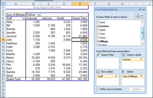
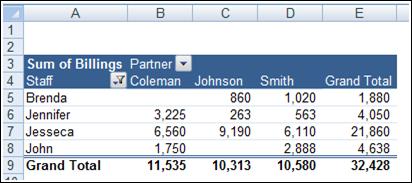
Next format and filter the Pivot Report. Very quickly your report comes together as shown below. Notice the filter button has been applied and a Pivot table style has also been applied for appearance.
Double clicking on any number in a pivot report will automatically produce a new worksheet complete with all supporting detail that comprises the summary number.
There are a multitude of PivotTable options that can be applied to alter the appearance or behavior of your Pivot table.
Key Points Concerning Pivot Tables are as Follows:
a. You can create as many Pivot Reports as you want from your initial raw data page. Your raw data remains unchanged as new Pivot tables are created.
b. As your raw data changes, your pivot tables are updated each time you press the refresh button. Or if you prefer you can set your PivotTables to update themselves at regularly scheduled intervals – say every ten minutes.
c. A key to understanding PivotTables is understanding the relationship between the Blank Pivot palette and the PivotTable Field list. As data is selected in the list, it appears on the Pivot table Report.
d. You can alter the PivotTable simple by dragging and dropping the field names in different locations on the Pivot palette, or in different locations in the PivotTable Field list Box.
e. PivotTables can be pivoted.
f. PivotTables can be sorted by any Column. (Or by any row when sorting left to right)
g. PivotTables can be Filtered.
h. PivotTables can be Drilled.
i. PivotTables can be copied and pasted.
j. PivotTables can be formatted using PivotTable Styles, as shown below.
k. Subtotals and grand totals can be displayed or suppressed at the users desire.
l. PivotTable Data can be shown as numbers or percentages at the users desire.
m. PivotTable can not only be summed, it can be averaged, minimized, maximized, counted, etc.
n. Blank rows can be displayed or suppressed at the users desire.
o. A new feature called “Compact Form” organized multiple column labels into a neatly organized outline which is easier to read.
p. PivotTables can query data directly from any ODBC compliant database. The PivotTable tool for accomplishing this task is not included in the ribbon – you will find it by Customizing the Quick Access Tool Bar and searching the “Commands Not Shown in the Ribbon” tab to find the PivotTable and PivotChart Wizard Option.
q. Many accounting systems can push data out of the accounting system into an Excel PivotTable format – this is commonly referred to as an OLAP Data Cube. OLAP data Cube is just a fancy word for PivotTable – and there is no difference.
r. PivotTables can automatically combine data from multiple data sources. The PivotTable tool for accomplishing this task is not included in the ribbon – you will find it by Customizing the Quick Access Tool Bar and searching the “Commands Not Shown in the Ribbon” tab to find the PivotTable and PivotChart Wizard Option.
s. Excel also provides a PivotChart function which works similarly to PivotTables. Presented below is an example PivotChart.

Excel 2003 PivotTables work very similarly as shown below. Excel creates a blank PivotTable, and the user must drag and drop the various fields from the PivotTable Field List onto the appropriate column, row, or data section. As you drag and drop these items, the resulting report is displayed on the fly. Here is the blank Pivot Palette view.

Now drag and drop field names from the Pivot Table field list onto the Pivot pallet. This action will automatically create Pivot Table reports – and they will change each time you drop additional field names, or move field names around. Presented below are but a few examples of hundreds of possible reports that could be viewed with this data through the PivotTable format.

This report shown above shows the total resulting sales for each marketing campaign for each of the 4 months marketing campaigns were conducted.
In this screen we see the same information is shown as a percentage of the total. A few observations include the fact that overall Radio Spots are the most profitable type of campaign, but only in April and July. In January and October, local ads and direct mail, respectively, produce better results. Further, April campaigns had the best response overall.

Further analysis in the screen above tells us that our results vary widely from one city to the next. In New York, coupons were least effective, but coupons were most effective in Columbus. Pivot charts based on PivotTable data can be modified by pivoting and/or narrowing the data. They can also be published on the Internet (or on an Intranet) as interactive Web pages. This allows users to “play” with the data. The chart below provides a visual look at the data shown above.

Filtering Pivot Tables - If you take a close look at your resulting pivot tables, you will notice that Excel automatically inserts a filter button on each field list as shown by the drop down arrows in the screen below:

This drop down filter list makes it easy to refine your report to include just the data you want.
Drilling Pivot Tables - Another nice feature in pivot tables is that they are automatically drillable. Simply double click on any number in a pivot report top have Excel automatically insert a new sheet and produce the detailed report underlying the number you clicked on. An example of this is shown below:

Pivot Table Options - By right mouse clicking on your pivot table you will reveal several option settings boxes as shown below. For example, these options boxes control the types of subtotals produced in your pivot reports. Excel also offers a pivot table options box as well as a layout wizard that makes producing pivot tables a little easier.


Data Table (“What-if Analysis”)
Data tables are part of a suite of commands that are called what-if analysis tools. When you use data tables, you are doing “what-if analysis”. What-if analysis is the process of changing the values in cells to see how those changes will affect the outcome of formulas on the worksheet. For example, you can use a data table to vary the interest rate and term length that are used in a loan to determine possible monthly payment amounts.
Three categories of What-if Analysis Tools - There are three kinds of what-if analysis tools in Excel:
1. Data Tables
2. Goal Seek
3. Scenarios
A data table cannot accommodate more than two variables. If you want to analyze more than two variables, you should instead use scenarios. Although it is limited to only one or two variables (one for the row input cell and one for the column input cell), a data table can include as many different variable values as you want. A scenario can have a maximum of 32 different values, but you can create as many scenarios as you want.
Loan Analysis - In this exercise, we start by creating a simple Payment function to calculate the payment amount of a loan given a loan amount, interest rate and number of periods.

The next step is to create a “Two-Way Data Table” displaying the resulting payment amount given a variety of lengths of the loan. This process is started by creating a list of the alternative loan amounts, as shown below in B8, B9, B10, etc. Cell C7 must reference the results you want to be displayed in the table.

The next step is to highlight the data table range and use the Data Table command under the Data menu (as shown below) to generate the desired table.

This process will generate the following table:

This table tells us that the same loan amount will require a monthly payment of $3,331 to pay the loan off in just 10 years, and a monthly payment of $5,800 to repay the loan in just 5 years.
The next step in this exercise is to generate a line chart based on the data table we just created. This line chart will provide some interesting observations regarding the benefits and detriments of paying off loans over longer periods.

The resulting chart is shown as follows:

Based on this, no one should ever obtain a fair market loan for more than 15 years, the reduction in payments simply aren’t worth the additional length of the loan. This same basic behavior is seen whether the interest rate is 1% or 100%. The only time you might be justified in obtaining a loan loner than 15 years might be when you are extended a favorable interest – this better than a fair market interest rate.
If you know the result that you want from a formula, but are not sure what input value the formula needs to get that result, use the Goal Seek feature. For example, suppose that you need to borrow some money. You know how much money you want, how long you want to take to pay off the loan, and how much you can afford to pay each month. You can use Goal Seek to determine what interest rate you will need to secure in order to meet your loan goal. Goal Seek works only with one variable input value. If you want to accept more than one input value; for example, both the loan amount and the monthly payment amount for a loan, you use the Solver add-in discussed at the end of this manual.
Scenario Manager allows you to create and save multiple “what if” scenarios (such as best case, most likely, and worst cases scenarios). You can also create a summary table of the scenario results in seconds. It is particularly useful for worksheets such as budgets in which users have often saved multiple copies of the same worksheet to accomplish the same objective. An example is shown below. In this example, a tire company has prepared a revenue budget for the coming year, and has created three alternative scenarios to generate the revenues that will result given a variety of mark up assumptions – in this case 100%, 110% and 120% markups.

Pressing the summary button in the scenario manager dialog box will create the following Pivot Table of possible alternative results. Here we see detailed revenue projections for all tires and labor fees given all three possible scenarios of 100%, 110%, and 120% markup.

With a few simple copy paste commands, the newly created data can be positioned and formatted next to the original projections as shown in the screen below.

Of course the scenarios above could have been created easily using simple formulas instead of using the scenario manager tool as described above. This underscores that best purpose of scenario manager which is to keep track of older and changing data through time, rather than producing what-if scenarios. For example, a complex projection containing scenarios based on original assumptions, revised assumptions, and final assumptions will allow management to go back and review the assumptions used throughout the project, and see how those assumptions changed as project planning progressed.
Data - Text to Columns
As discussed earlier in this manual, often CPAs receive data from their clients or IT departments that is in text form. When this happens, Excel can split the contents of one or more cells in a column and distribute those contents as individual parts across other cells in adjacent columns. For example, the worksheet below contains a column of full names and amounts that you want to split into separate columns. The Text to Columns Wizard parses the data automatically into separate
Select the cell, range (range: Two or more cells on a sheet. The cells in a range can be adjacent or nonadjacent.), or entire column that contains the text values that you want to split. Note A range that you want to split can include any number of rows, but it can include no more than one column. You also should keep enough blank columns to the right of the selected column to prevent existing data in adjacent


Data Consolidate
Excel can combine, summarize, and report consolidated results from separate worksheets. The underlying worksheets can be in the same workbook or in other separate workbooks. There are two different sitautions as follows:
1. You Are Consolidating Similar Data – Such as departmental budgets where every worksheet contains the exact same labels in the exact same cells. In this case, you can write a “Spearing Formula” which can consolidate the necessary information easily.
2. You Are Consolidating Dis-Similar Data – The various worksheets contain different row and column descriptions located in different locations on the worksheets. In this case you should use the Data Consolidate command.
For example, assume that you have received budgets from multiple departments, and you want to combine them together. In this case, Excel will do the work for you. You can use a consolidation to roll up these figures into a corporate budget worksheet, as shown below.


Data Grouping & Outlining
If you have a list of data that you want to group and summarize, you can create an outline of up to eight levels, one for each group. Each inner level, represented by a higher number in the outline symbols displays detail data for the preceding outer level, represented by a lower number in the outline symbols. Use an outline to quickly display summary rows or columns, or to reveal the detail data for each group. You can create an outline of rows (as shown in the example below), an outline of columns, or an outline of both rows and columns.

Web Queries
Excel includes pre-designed “queries” that can import commonly used data in 10 seconds. For example, you could use a web query to create a stock portfolio. All you need is a connection to the Internet and of course, some stock ticker symbols. In Excel 2003 select “Data, Import External Data, Import Data” and walk through the web query wizard for importing stock quotes. In Excel 2007 and later use the Data Ribbon, Existing Connections, Stock Quotes option. In seconds, Excel will retrieve 20 minute delayed stock prices from the web (during the hours when the stock market is open) and display a grid of complete up-to-date stick price information that is synchronized to the stock market’s changing stock prices. With each click of the “Refresh” button, the stock price information in Excel is updated - this sure beats picking numbers out of the newspaper.

Completing the Stock Portfolio – Next link the grid data to another worksheet, and insert new columns containing the number of shares owned, as wells as an additional column to computer the total value based on shares owned, as shown below.

Refreshing the Stock Prices - Once you have created your portfolio, simply click the Refresh Data button on the “External Data” Toolbar in Excel 2003 or on the “Data Ribbon” in Excel 2007 shown below to update the current value of your Portfolio.


Query Parameters - There are numerous options to help you extract exactly the data you want they way you want it. The “Web Query Parameters Box”, “Web Query Options box” and “External Data Properties Box” provide numerous options for controlling your web query.
To use Microsoft Query to retrieve external data, you must:
1. Have access to an external data source - If the data is not on your local computer, you may need to see the administrator of the external database for a password, user permission, or other information about how to connect to the database.
2. Install Microsoft Query - If Microsoft Query is not available, you might need to install it.
3. Specify a source to retrieve data from, and then start using Microsoft Query - For example, if you want to insert database information, display the Database toolbar, click Insert Database, click Get Data, and then click MS Query.
For example, suppose we have some data in our accounting system – Sage MAS 200 ERP that we would like to analyze in Excel. We can use the Database Query Wizard to build a query that will extract the data we need and place it in an Excel spreadsheet.


The first step is to select the type of database you want to query and to select the specific database.

Upon the selection of the desired database a list of tables will be presented. Choose the desired tables, and select the desired data fields to be imported. You will then have the option to filter and sort the data before it is imported. Finally you will be given the option to save the query so that you can run it at a later date without having to start from scratch. Excel will then return a table full of the data you requested as shown in the screen below.


